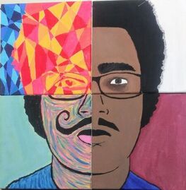
Title: Quadrants
Size: 61 cm x 61 cm
Medium: Acrylic on Canvas
Date: December 2019
Exhibition text
"Quadrants" is a piece inspired by four of the artistic movements throughout history: The Surrealism, Cubism, Pop Art, and Baroque. Each movement has significant differences and similarities in colors, line, shape and ect. These four movements symbolize the many ideas and personalities everyone has. One person can feel like they are being four different people at times and it is important to not get lost in one of these personalities.
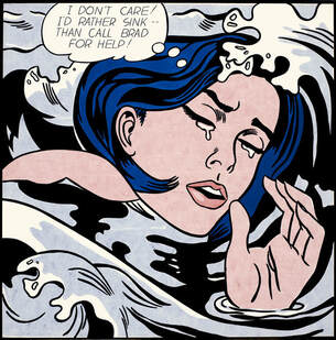
"Drowning Girl" by Roy Lichtenstein (1963)retrieved from https://www.paintingstar.com/item-drowning-girl-1963-s195794.html
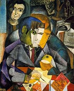
"Portrait of V. Nubiola" by Joan Miro (1917) retrieved from http://worldoftheatreandart.com/joan-miro-famous-spanish-surrealist-artist/
Technique Each quadrant required a different techniques however techniques did transfer over once in a while. I used a very small paintbrush for precision on the cubist canvas. This is because any colors that majorly overlap would be easily seen and defeat the precision that is Cubism. I used this for every other piece in any smaller spaces so I would need very precise lines. Especially in the Pop art piece because the lines on a comic book are actually printed which makes them very precise. For the Baroque canvas I followed exactly what I did for my piece, "Trayshaun J." which is a working through a slow process of layering and shading. I however have no worked at all with anything Surrealist which the entire process a experiment. Experimenting with different strokes and colors.
|
Inspiration Roy Lichtenstein was an American artist who centered his work around several different movements. However his most prominent being the pop art movement which allowed heavy lines, and solid colors, which created a cartoon like image. I used this piece to represent a more child-like side to a person. Someone you would see when you're out with friends.
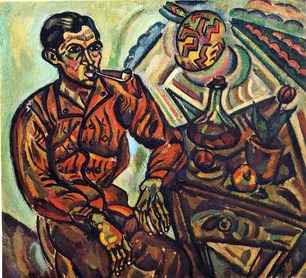
Diego Rivera was a prominent Mexican painter who worked in many different ways. A common way he worked was in Cubism where lines would be used to creates figures and separate colors. I used cubism to symbolize complexity. This more specifically relates to a person whom has a lot of pressure on them, or who is in a difficult situation. Joan Miro was a Spanish artists who worked with paintings, sculptures, and even ceramics. He is mostly known for his simplistic designs and child-like artwork. This piece however was before his simplistic work, embodying more of a Surrealist style. This style represents the depressed person, a person who can't find their way. The Surrealist idea is that of questioning reality, changing something in an artwork that makes it almost dream like. Johannes Vermeer was a Dutch painter based in the Baroque movement. His paintings focused on shading in order to create a realistic image. Compared to the other styles Baroque is not specific on lines and shapes but on gradient and shading. This creates a feeling that rivals the comic book-like pop art and seems very much more solemn. The Baroque quadrant represents the serious, or angry side of a person. 
|
Portrait of Ramón Gómez de la Serna by Diego Rivera (1915) retrieved from http://www.thegreatgodpanisdead.com/2012/06/diego-riveras-1915-portrait-of-ramon.html
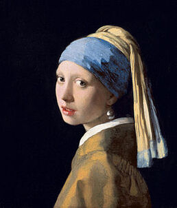
"Girl With the Pearl Earring" by Johannes Vermeer (1665) retrieved by
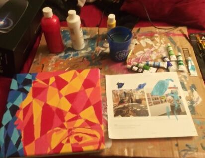
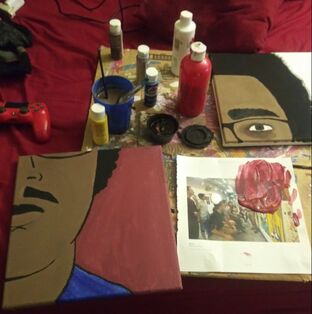
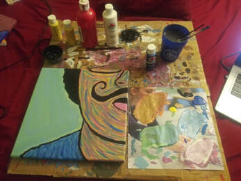
Experimentation I experimented throughout this experiment due a lot to the fact that I haven't used the majority of these styles to paint. Cubism and Baroque styles I have some idea what is needed but Surrealism and Pop art I have no experience and I think that it can be seen throughout my work. I experimented with mixing paints several times throughout this artwork; when creating the cubism and pop art quadrants specifically. Many different colors were created which is present in my process pictures. As stated in my Technique paragraph I used many different strokes and colors to create the surrealist piece. Also, the tracing process was strange. I used a box to prop up the projector and I just projected on my wall. I then used the corner of my wall to get a straight line. And when tracing on the side away from the wall, I put two quadrants up and held them there.
|
Planning
I had this idea when I was looking at my Comparative Study where I am comparing the work of Joan Miro and the work of Roy Lichtenstein. These artists have to very distinctive styles and I felt like I could not do one over the other. At first I was only going to do two 2 ft by 1 ft but I wanted more variety. Then I remembered back to my self portrait and I though of showing four personalities of a person. The serious, somewhat angry, realistic personality would be the Baroque style cause it reminds me of a photograph because of how it captures light and shading. Surrealism is strange and often questions how we perceive reality; it introduces a strange perspective to what we see as normal. This represents thinking and being unsure, questioning everything. Cubism is complex, created by making lines on lines it seems so basic but during the process of creating or even looking at it you can see that something isn't simple. The methodical planning of every color position gives this style a complexity to it. This personality represents the complex though and planning; being precise and methodical to everything you do. And last is the Pop art style. This style comes from Roy Lichtenstein but ironically represents a lot of what Joan Miro's work represents in this piece. This artwork originates from a DC comic book strip which reminds me a lot of childhood. In childhood you do things like read comic books. Also because of the solid colors and thick lines, the painting looks a lot like something potentially from a coloring book.
Process
|
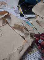
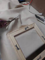
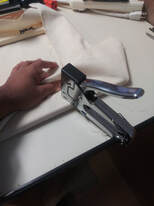
The first steps in creating any painting is to create your canvases. I used four 1ft x 1ft to create my entire artwork. To create them I put together the frame. Before stapling it I had to measure the angle of the frames and make sure they were each 90 degree angles. After this I stretched a large roll of canvas out and cut only what I needed. After this I folded the canvas around each of my frames and stapled it down after pulling it to make sure it was tight. After this process was done I had to gesso the canvases which would tighten them and prevent the acrylic paint from seeping into the holes the canvas has.
The second process was tracing the image onto each canvas. I took a picture in my room and uploaded it to my computer. I then used an HDMI cord to project the image on my wall. I then used the corner of my wall to use as a straight point where I could start tracing. I then used two canvases every time I was tracing one so the measurements would be correct. The four quadrants came out fairly well. The next process was the painting which took around four days to complete doing a quadrant a day. The first day I worked on the Cubist piece which required a ruler and a pencil. I really just put random lines across the paper going diagonal, and horizontal. I didn't like how a vertical line would stand out so I decided to use very few. I then mixed different amounts of red an yellow together. I would use these warm colors in the face portion making sure no color was directly next to the same color. I did this by using a large amount of one color at a single time and then going back and going over some of the places that could use more. After I was done with the face portion, I moved onto the background which was a similar process, using different amount of white, and a very small amount of yellow to create different shades of blue. 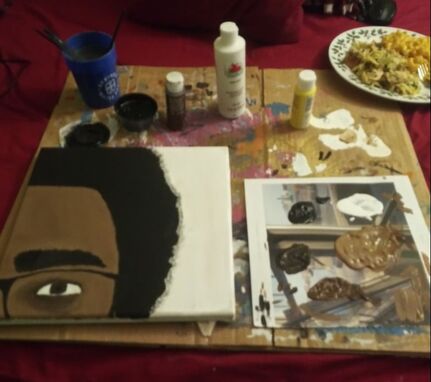
The third quadrant I painted was the Pop art area which I think has good and bad elements. Lichtenstein uses this style of Benday dots and I was unable to do this. I didn't follow my tracing 100% because it had features like shading that wouldn't be used on a face looking straight on. I first outlines the face and shirt in black which gives it the comic book "pop" because of a solid background color. I then used red, blue, and yellow to create a rich brown that I would be able to use for my face. After putting that down I used another element from Lichtenstein's style of painting the top lip pure black which again gave it the comic book pop. I then added the lines like under the lip, and the mustache, and the nose. After that I covered the background in a red that I thought would come out lighter, and a blue which I added a gradient to.
The last step in the creation process for this piece was the painting of the surrealist canvas. This wasn't very hard because I started off with putting the black down where it needed to be similar to how I started the other quadrants. This quadrant I wanted to seem whimsical and creative so I added a handle bar mustache. I started off by putting pink and orange down on the canvas with the lines of the face. So the mustache, lips, nose, and chin were the basis of every line I put down on the canvas. I then put the blue on the shirt which is complemented by this mint like shade. The blue is also a comparison point to the other side of the shirt in the Pop art quadrant.
|
The next quadrant I decided to paint was the Baroque quadrant. First I painted the background white so that the contrast against my black hair and darker skin tone. Then I painted on the hair which was just solid black. Then I decided to and a small amount of white to the black (which created a Metropolis Black) to use for the glasses. This is because the glasses are a bit lighter than solid black, and also I was able to establish a difference in the glasses and the hair. I then did the eyebrows which I realized was a mistake because I should've done the skin tone under the eyebrow first. I ended up using three different skin tones because the paint I used dried to a different color then it shows. The paint I use is cheap however it got the job done. I settled on a lighter skin tone that I would use. I then painted the iris of my eye with the solid brown I had already created for the face. I used this same brown to make the lines for the eyes. The walnut brown I created for the face, I then used to add shading to the eyes. This shading would show the stress and/or seriousness of the Baroque style more obviously.
|
Reflection
I definitely enjoyed this process, especially the surrealist and cubist pieces because of all the colors I was able to experiment with. I do believe that I execution of the pop art style could've been better. It doesn't. pop at all which I think is due to the dark colors I used in the skin and in the background. I had trouble blending red and I ran out of actual red and I had to settle for the red that comes out pinkish. I feel like the other quadrants though really show my idea of four different personalities well. The use of line and color is right were it needs to be and the vision I had came out even better that I could've thought it.
ACT Questions
Clearly explain how you are able to identify the cause effect relationship between your inspiration and its effect on your artwork?
Each of my quadrants are a direct connection with the movement and emotion they represent. The baroque canvas doesn't focus on much shading however it does contain elements of realism. This is seen with the shading around the eyes and the eye bags that are present. The surrealist piece is actually very connected to fauvism with how it looks however the meaning is connected to surrealism. This piece is about showing the whimsical, creative side of the mid, often considered the right side of the brain. The pop art movement was supposed to be connected by the background and color highlight but when mixing paints something happened. The cubism piece is connected to cubism by the color and process of creation. Using lines to separate colors and comparing the warm colors with the cold colors.
What is the overall approach the author has regarding the topic of your inspiration?
Back in the time period of each of these movements, people felt many different ways about the artworks. The Baroque portraits were probably seen highly in society, however the surrealism was not. Many people didn't necessarily like the idea of someones face melting and what the artwork portrayed about society. Now people have come to appreciate many kinds of artwork, the strange and the formal. All of these movements have emotions connected through them by how they were seen at the time. I used a present time emotional filter, assigning each movement to show a emotion, a different kind of person. What the artists did in their respective time periods, I have did in the present except it is with their work.
What kind of generalizations and conclusions have you discovered about people, ideas, culture, etc. while you researched your inspiration?
The older the time period, the more focused people seem to be on creating realistic images. I believe this is due to the photography we have today because we can get hundreds of high resolution photographs in just several minutes but paintings took precision by hand. People back then wanted things like photographs and so these portraits were created. It holds the same purpose as a photograph.
What is the central idea or theme around your inspirational research?.
The theme around my inspiration is the idea that artistic movements can be associated with feelings. When we see a realistic painting it seems somewhat formal but when we see a simplistic child-like artwork it seems silly and casual.
What kind of inferences did you make while reading your research?
I made inferences when researching Diego Rivera because it didn't mention his focus on one specific movement, however it did say that he sparked murals in the Mexican Art movement. I assume he created a lot more different types of artworks rather than just Cubism because of the influences he had.
References
“Roy Lichtenstein Biography.” Roy Lichtenstein Foundation, https://lichtensteinfoundation.org/biography/.
“Joan Miro.” Guggenheim, https://www.guggenheim.org/artwork/artist/joan-miro.
“Diego Rivera, His Life and Art.” Diego Rivera - Paintings,Murals,Biography of Diego Rivera, https://www.diegorivera.org/.
“Johannes Vermeer (1632–1675).” Metmuseum.org, https://www.metmuseum.org/toah/hd/verm/hd_verm.htm.
“Joan Miro.” Guggenheim, https://www.guggenheim.org/artwork/artist/joan-miro.
“Diego Rivera, His Life and Art.” Diego Rivera - Paintings,Murals,Biography of Diego Rivera, https://www.diegorivera.org/.
“Johannes Vermeer (1632–1675).” Metmuseum.org, https://www.metmuseum.org/toah/hd/verm/hd_verm.htm.
